Client: Whipsaw
Location: San Francisco, U.S
Disciplines: Brand Development, Artwork
Whipsaw
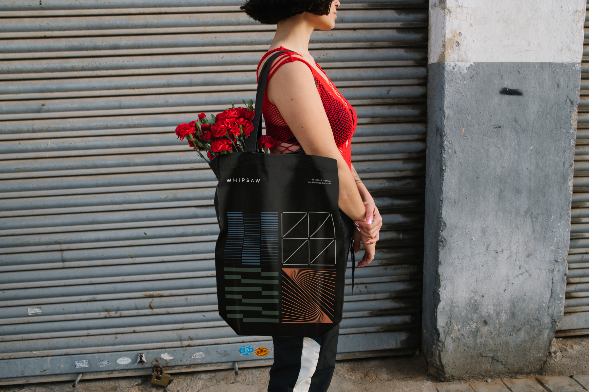
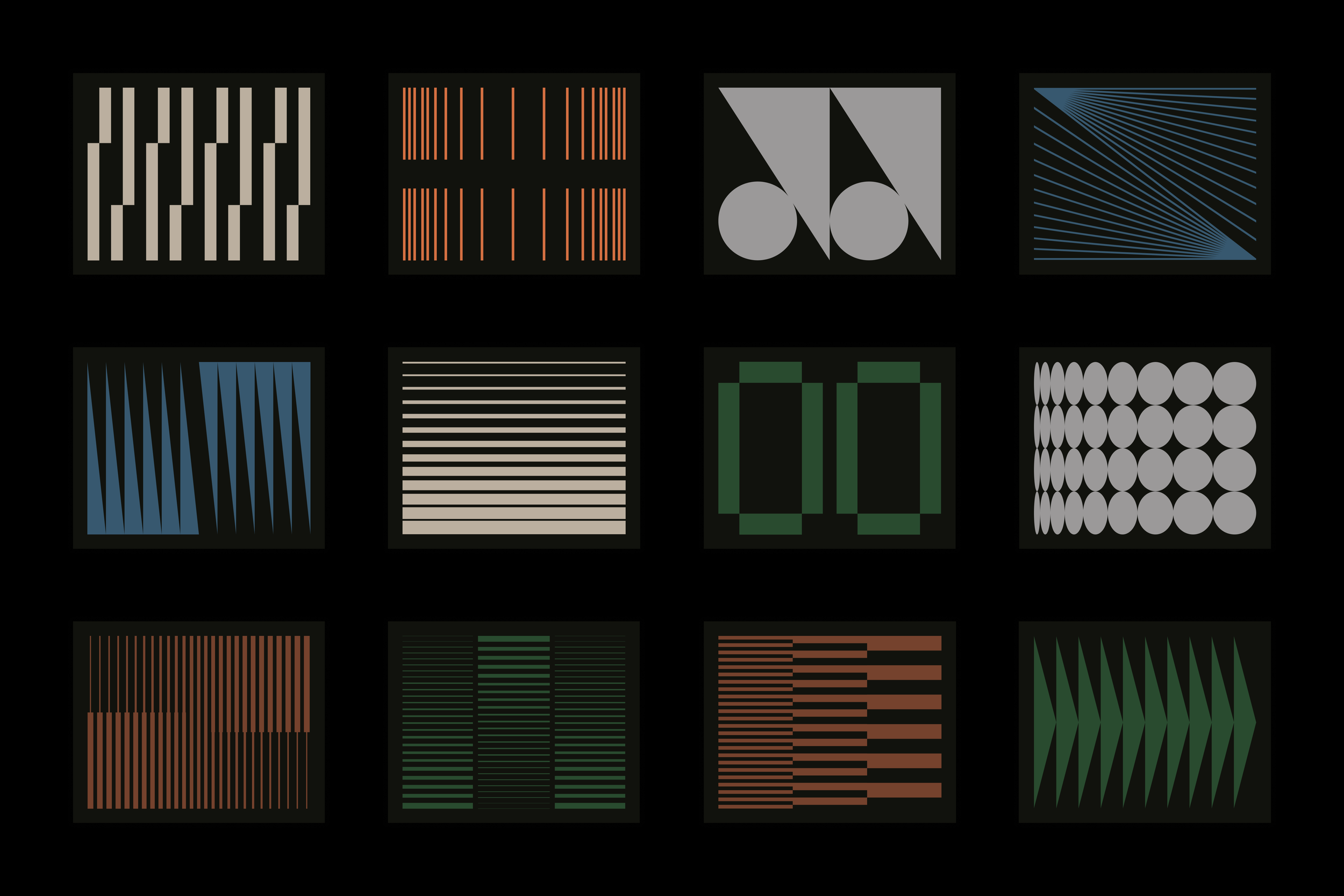
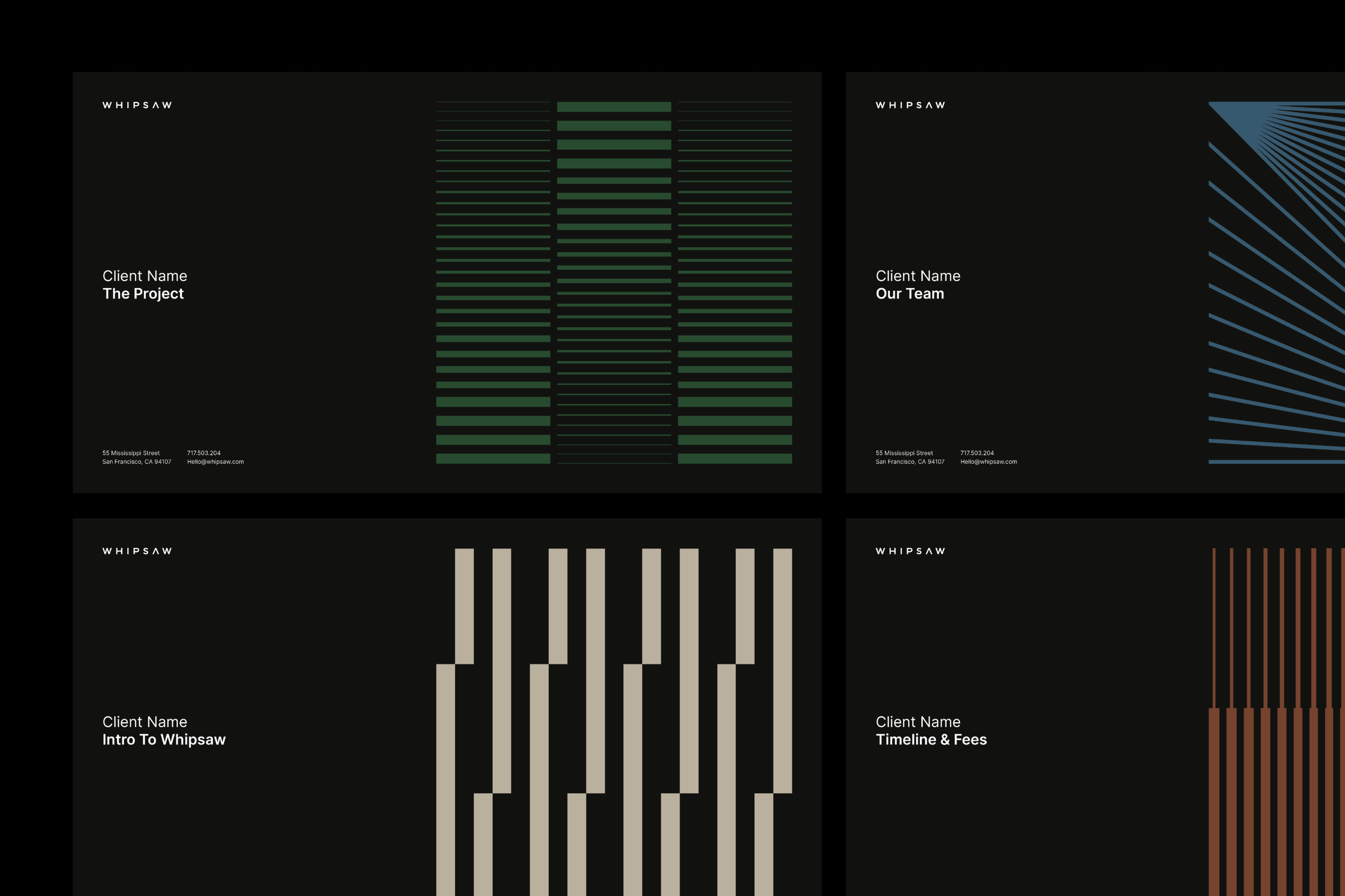
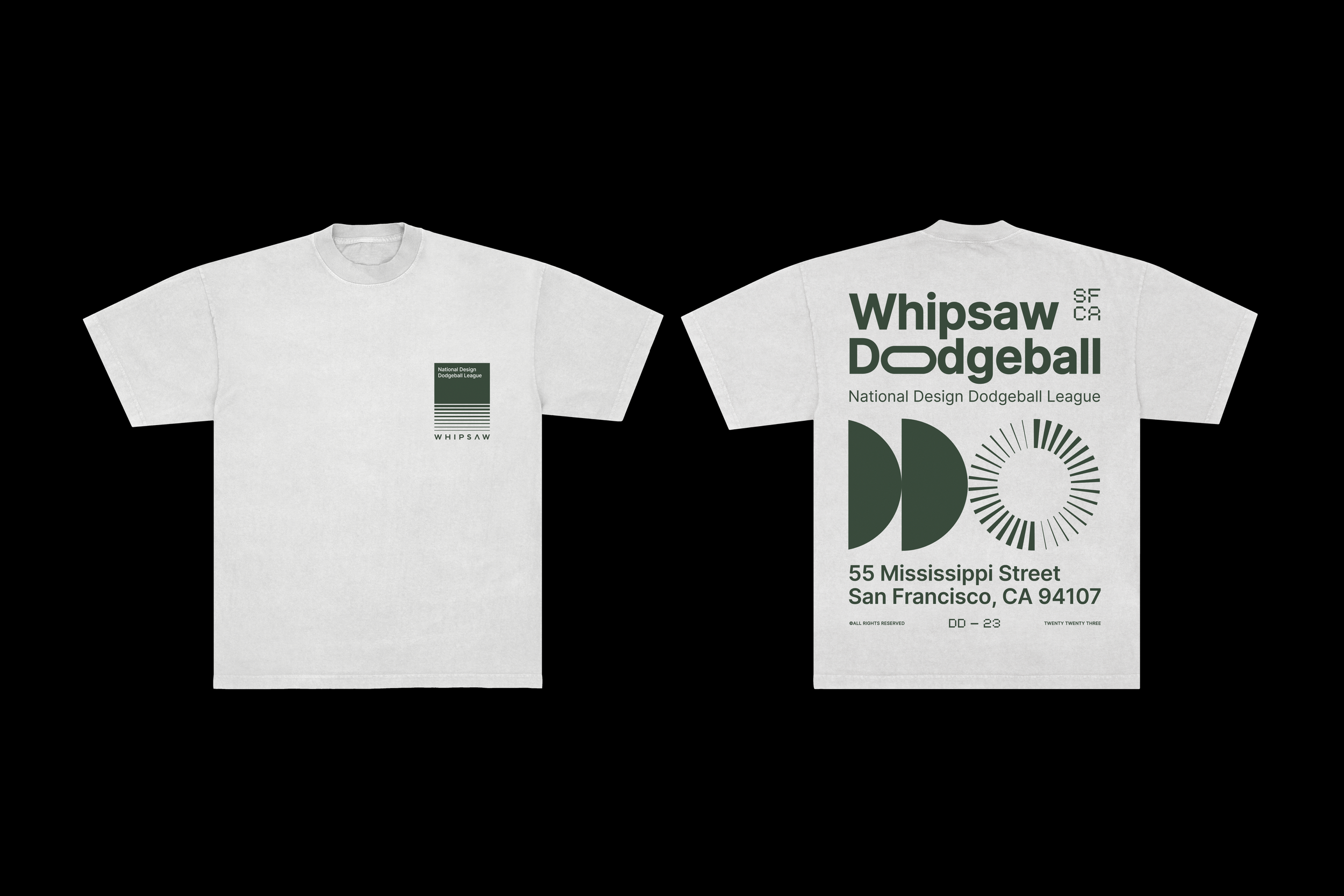
San Francisco's product design studio, Whipsaw, approached us for assistance in revitalizing their brand identity. Their primary goal was to establish a unified theme across all collateral, incorporating graphic elements that could resonate throughout the brand. Our process began with a refresh of their existing color palette, drawing inspiration from the real-world materials integral to their daily work. Subsequently, we explored graphic devices, opting for elements that conveyed a sliced appearance, reinforcing the visual association with the "saw" aspect of their brand name.

![15.png](https://images.squarespace-cdn.com/content/v1/6523c1819751e579904b9896/35463d4c-30b8-4bdb-8a6b-ba8f78102415/15.png)
![16.png](https://images.squarespace-cdn.com/content/v1/6523c1819751e579904b9896/af759985-17bf-4912-8394-cfb2da03dbb1/16.png)
![18.png](https://images.squarespace-cdn.com/content/v1/6523c1819751e579904b9896/af18e218-1d2e-405b-9e53-c351def78685/18.png)
![17.png](https://images.squarespace-cdn.com/content/v1/6523c1819751e579904b9896/b5851e3f-c8ac-4d3a-b636-dd9918bbb7a9/17.png)
![19.png](https://images.squarespace-cdn.com/content/v1/6523c1819751e579904b9896/595ca907-421c-49fb-affd-8897d3b69e62/19.png)
![23.png](https://images.squarespace-cdn.com/content/v1/6523c1819751e579904b9896/075a17ef-8846-4461-be24-55218f1a71bc/23.png)
![24.png](https://images.squarespace-cdn.com/content/v1/6523c1819751e579904b9896/f8062695-b3da-4bfe-8502-02aee06a68f5/24.png)
![30.png](https://images.squarespace-cdn.com/content/v1/6523c1819751e579904b9896/4dbe61bf-2e0e-4204-983d-7c7d3adc8559/30.png)